
Recent work
A sample of the brands and sites we've brought to life.

Tripp Umbach
Tripp Umbach had decades of real authority in healthcare, higher education, and economic development consulting, but their website still read like a research vendor's, dense, hard to navigate, and stuck in the wrong era of their own story. We rebuilt the site from the ground up: streamlined structure, benefit-led copy, and a custom CMS that lets their team manage an entire library of case studies without ever touching a developer.

Crossroads Golf KC
Crossroads Golf KC had the hard part figured out: best-in-class TrackMan tech, a can't-miss Crossroads Arts District location, and zero brand to match it. Golf brands tend to read as exclusive and intimidating; we built one that talks to the league player perfecting his swing at noon and the bachelor party showing up in hoodies at 8pm with the same confidence. A phased website built to capture a following before doors even opened, paired with a full photo and video library, gave Crossroads Golf KC a presence as energetic as the experience itself. Kansas City's next go-to destination, looking the part from day one.

CareGuide
CareGuide had real expertise in healthcare cost containment but a brand that did not carry that level of authority. We gave them a clear mission, voice, and one-liner built around the actual scale of what they do, a fresh logo and identity system, and a new website built to walk visitors from confusion to confidence, plus the collateral and email marketing to back up the sales process. CareGuide came out the other side looking like the trusted authority they already were, just finally able to prove it before the first conversation even started.

Dovetail Medical Consulting
Dovetail's founder had two decades of Workers' Compensation experience, the kind that grows a department from four people to twelve and helps merge five practices into one of the Midwest's largest orthopedic groups, but none of it lived anywhere outside a resume when he set out on his own. We built Dovetail from the name up: a brand identity and website structured around his three pillars, giving a single-owner consultancy the visual and digital presence of someone who already runs programs at scale. Now a referring provider can look him up and easily see exactly why he's worth the call.

Heddi Monro + The Dressing Room
Heddi Monro launched as two businesses under one roof, a boutique and a speakeasy, with one ambitious vision and zero language or visuals to hold them together. We gave the brand a unified voice and story that made sense of the dual concept, then built two distinct logos rooted in a Queen Bee theme, one for the boutique, one for the speakeasy, designed to stand apart while still reading as family. From there, the identity carried into everything from menus to napkins to event materials. What started as one bold concept on paper opened as two cohesive spaces with a shared story and a visual language built to match it.
Health Outreach Foundation
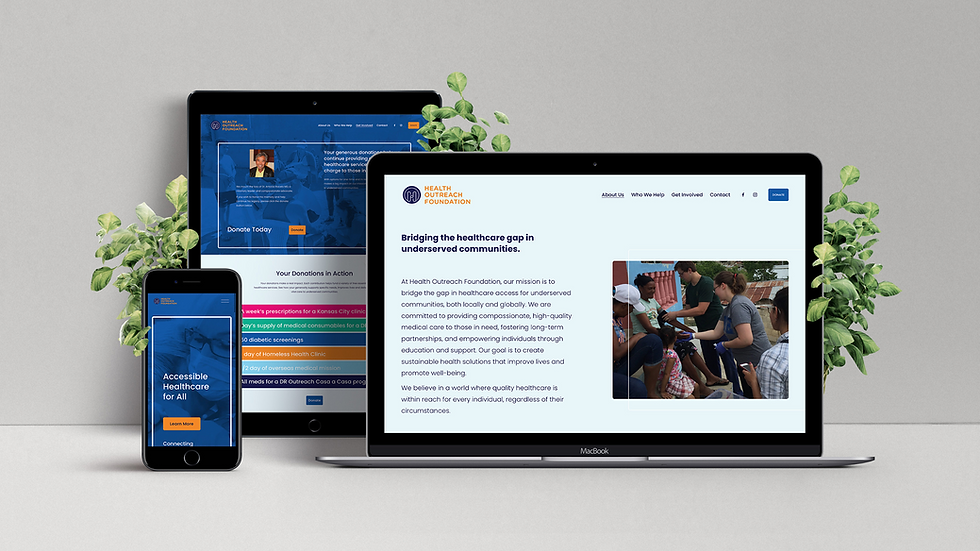
Health Outreach Foundation had real impact in Kansas City and the Dominican Republic, but a pandemic-era slowdown left their identity outdated, their message muddled, and donor engagement stalled. We rebuilt the brand from the ground up: a new logo and visual identity, a sharpened mission, vision, and one-liner, and a redesigned website that spotlights the two focus areas without overwhelming visitors. Automated donor thank-yous closed the gap on follow-up, and for their golf tournament, an on-brand event kit and email campaign turned one day of fundraising into a year-round pipeline of donors and volunteers instead of a one-off event.

Employee Capital Consulting
ECC had built a thriving payroll consultancy on word-of-mouth and a strong personal reputation, but no real brand to carry that reputation past the founder's own network. We built an identity and voice that shifted the center of gravity from founder to firm: sharp, structured visuals that read more boutique consultancy than freelancer, and a brand story that positions ECC as the expert who makes the system work, not just another vendor in it. A focused new website gave prospects a clear path from "who is this" to booking a call, with no one standing in the way of their own sales process.

True Dermatology
True Dermatology was relaunching under a new name after an ownership restructuring, needing to keep years of patient trust intact while introducing a brand nobody had seen before. We built the identity and voice from the ground up (full visual system, brand story, mission and values) then carried it through a phased rollout: a landing page to announce the transition, a full website to anchor the new digital presence, and the signage, mailers, and collateral to make the change feel intentional rather than disruptive at every single touchpoint, from business cards to the exterior of the building. Patients walked into the same trusted care, just under a name and a look built to carry that trust into its next chapter.

Here To
Erin had years of trust built through ceremony and retreat work, but as she stood up Here To, a more rooted home for that practice, there was no digital space that reflected the depth of what she offers. We built a Wix Studio site, complete with a layered events and booking system so clients could schedule, pay, and manage their own sessions with ease, and connecting Klaviyo on the backend so every email flows from the same place as the work itself. What exists now is a site that holds the practice the way Erin holds space: unhurried, clear, and built to meet the right women exactly where they are.

Boys & Girls Club of Greater KC
Boys & Girls Club of Greater Kansas City has served metro area youth since 1912, but a sprawling, hard-to-navigate website was burying their actual scope: ten sites, dozens of programs, decades of community trust, all buried under a confusing maze that made it hard for parents to find a program or a donor to find the "Donate" button. We built a brand new Wix Studio site organized around how people actually search: by audience, by program category, and by location, paired with on-site photography and a brand video that capture the real energy of the clubs instead of generic stock-photo optimism. A streamlined donation flow turned "I'd like to help" into a completed gift in fewer clicks, giving BGCGKC a digital front door that finally matches the size and impact of the organization behind it.

Blanc Champagne Bar
Blanc opened with a bold vision: an elevated champagne bar where popping in for a glass felt just as natural as celebrating life’s biggest moments. We translated that vision into a complete brand experience, creating the identity, voice, custom website, and the guest-facing details that carried the experience into the space itself, from menus and signage to art direction for photography and video. The result is a brand that feels as vibrant as a night at Blanc: beautiful, welcoming, and the kind of place people can’t wait to bring someone back to.

Ampere
Ampere had built an impressive reputation designing collegiate athletic facilities, but they had no website to show prospective clients who they were or why they work differently. We created a digital presence worthy of the brand, combining bold copy, custom photography, illustrated brand characters, and custom-coded interactive features, including a dynamic project map that lets visitors explore their work across the country. It’s energetic, unexpected, and every bit as innovative as the team behind it.